


indx
A smarter way to do spaced repetition flashcards. My entry for RocketHacks 2024. Winner of Best UI Design.
Inspiration
Spaced repetition flashcard apps like Anki are a mainstay of my studying routine. I use them in science classes, to study for quizbowl, to learn languages—pretty much everything. While flashcards have their limitations, in certain scenarios, they can be a great way to build long-term knowledge. I'm generally a big fan!
What I'm not a fan of, though, is making them. Good flashcards (particularly for spaced repetition) should hold a single piece of information, so making proper "atomic" flashcards means making a lot of them. From this struggle arose concepts of a solution—could there be a better way?
Yes. (at least i think so)
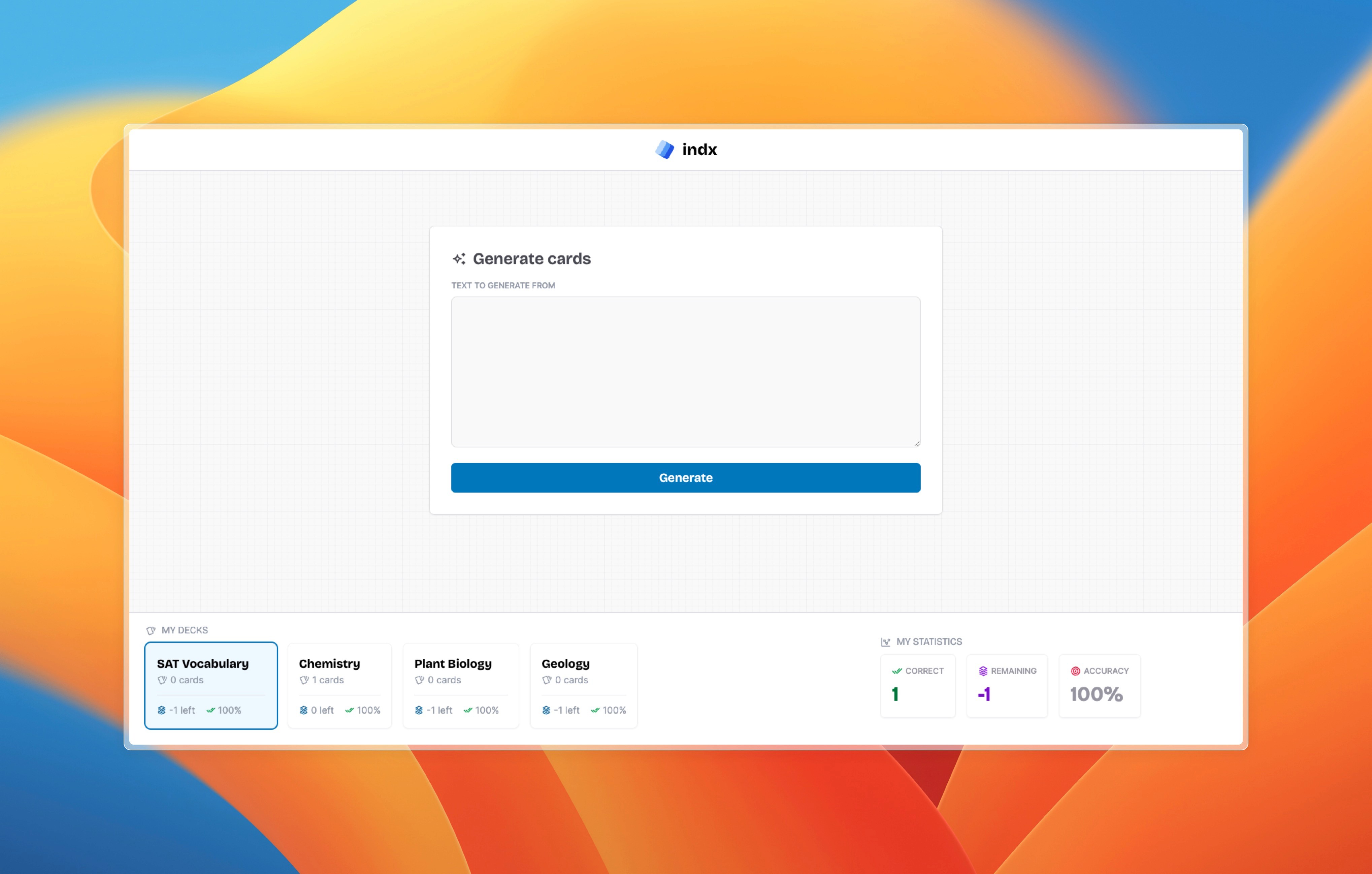
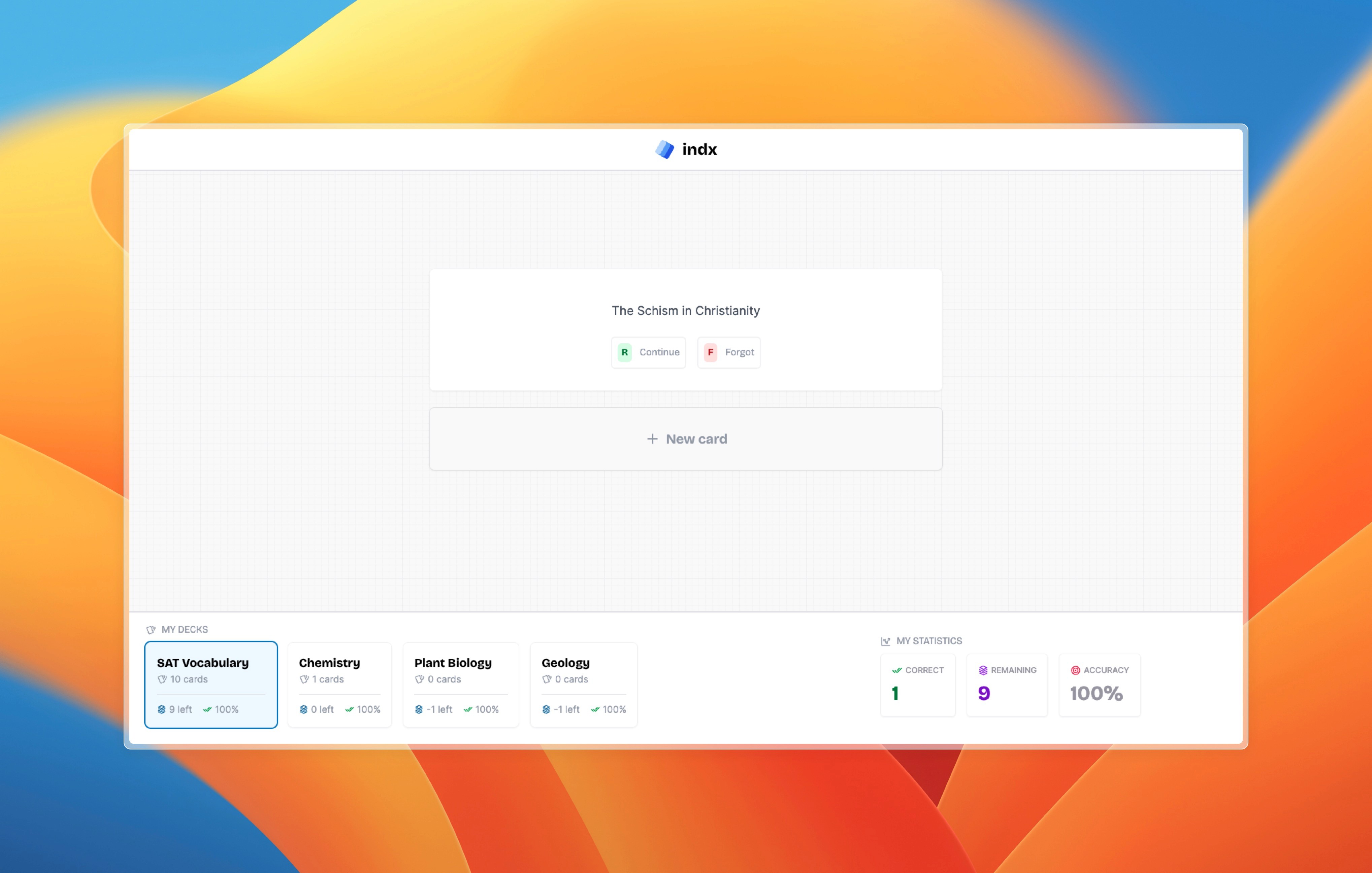
Indx is a spaced repetition flashcard app that automates the process of making flashcards. You provide it with your text - for example, notes from class, the study guide, an article you found online, etc. - and it will turn it into a set of nicely formatted flashcards following spaced repetition best-practices.
Let's talk code
For this hackathon, I had only about 24 hours to design and code my project as well as write the submission for Devpost. With that in mind, I chose to use the OpenAI API with some light prompt engineering rather than attempt the rather time-consuming endeavor of training my model from scratch. I used this to generate the actual flashcard text from notes.
The frontend interface was designed in Figma (like all my projects). I used the Nuxt.js framework as well as TailwindCSS to build it.
On the backend side, I used Koa (a Node framework similar to Express.js) for the very first time! I had a really pleasant development experience with Koa's well-written docs and super simple architecture and will definitely be using it again in the future.
Design stuff
Indx won Best UI Design at Rocket Hacks, so I felt it'd be appropriate to include a short section analyzing the user interface and some of the design choices I made.
Quick note: I made a few changes during the development process, so the Figma mockups below will not exactly match what you see in the slideshow of screenshots at the top of this page.
The hardest choice
Choosing fonts is always my favorite—but also possibly the most difficult—part of a project. The curl of a lowercase 'g' or the height of an 'h' can really profoundly affect the overall personality of a design, and while the importance of these sorts of tiny details are why I love design, it can be difficult to get everything just right.
For this project, I paired Bricolage Grotesque with Rasmus Andersson's incredibly popular Inter. The "techy", angular forms of Bricolage Grotesque contrast really nicely with Inter's warm, inviting character. Plus Jakarta Sans, with its comforting round letters, is used in a few places to further balance out and complement the coldness of Bricolage Grotesque.
Vibe check
I believe every good UI should have a personality. For indx, I had a playful, yet sleek and modern aesthetic in mind from the start. The goal was to create something that wouldn't feel out of place among cutting-edge AI apps while simultaneously remaining very approachable and friendly.
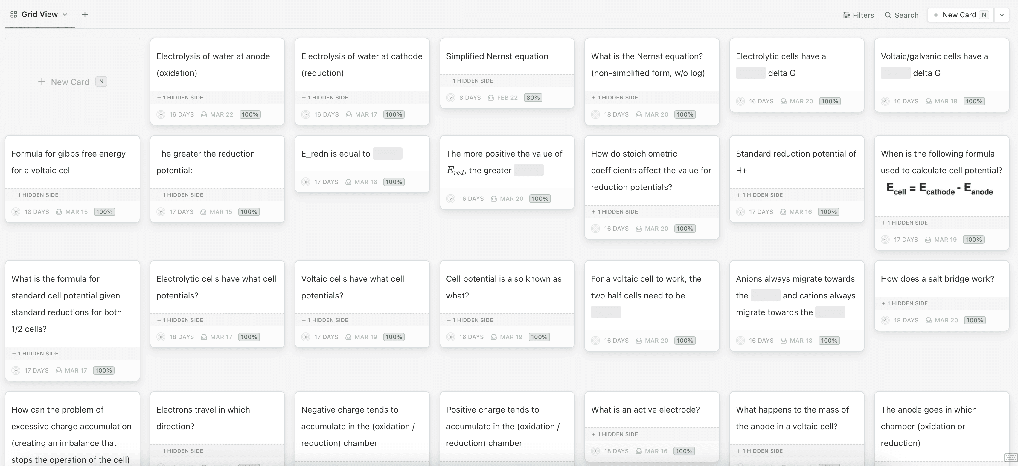
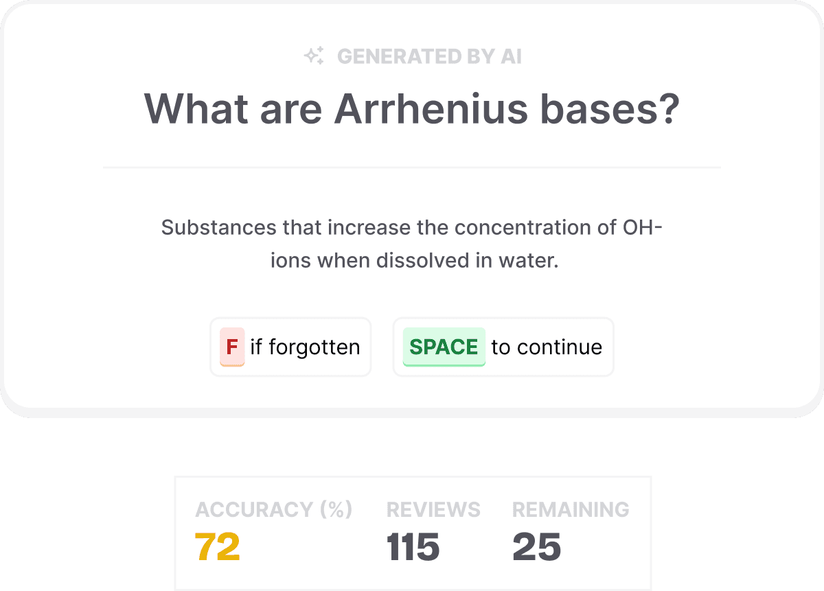
The cards
A couple design choices:
The thicker border on the bottom: this was meant to mimic a cartoony shadow, giving the card a bit of 3D depth while simultaneously adding a bit of playful personality.
The "f" and "space" buttons: these are inspired by SaaS webapps I've seen where computer keys feature a similar look.
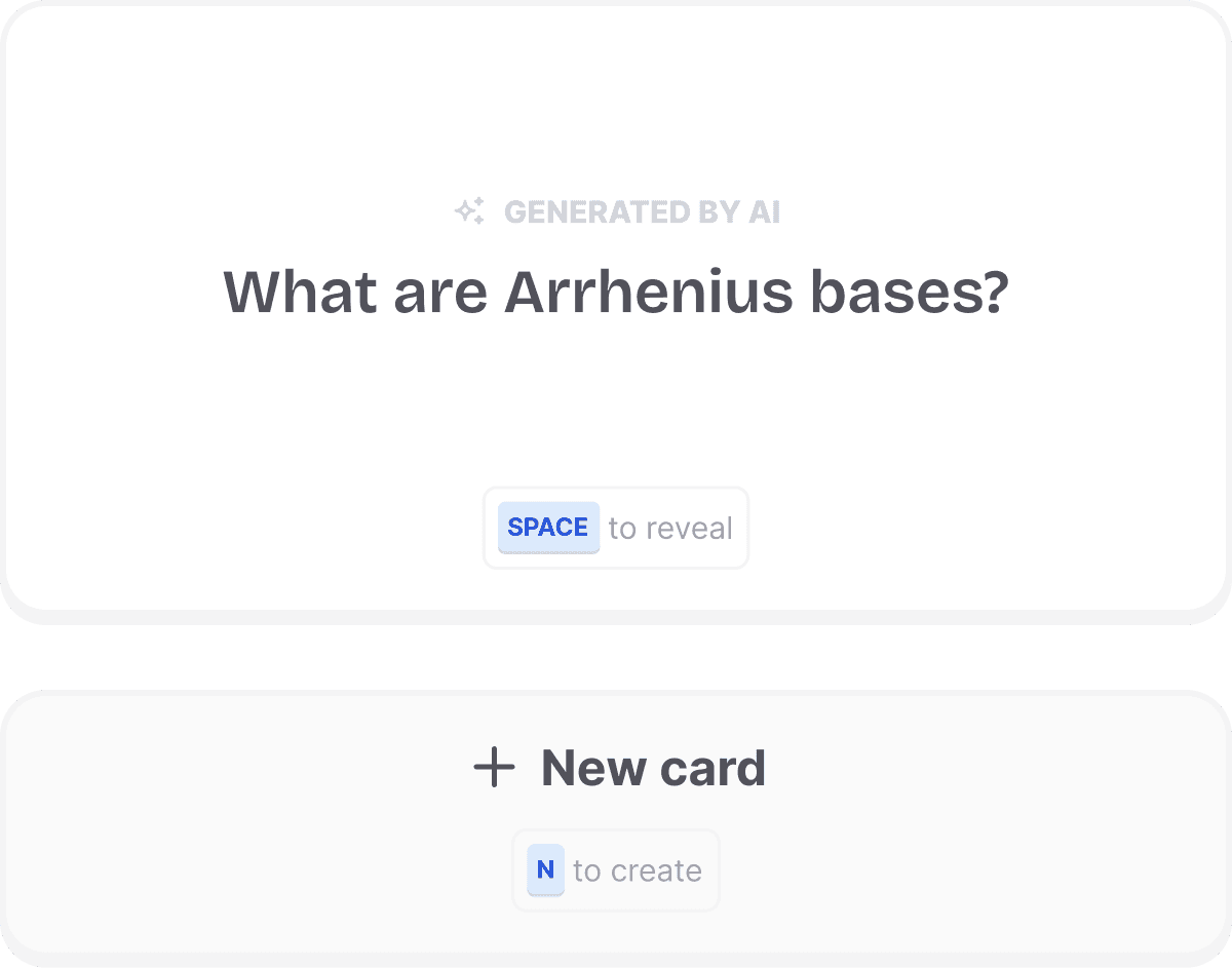
A card is born
Here's the card creation interface. On top, you have the AI-generated flashcard (which you can press space to flip and view the reverse side). Below, you can press N or click the large "new card" button to accept the card and add it to your deck.
I thought it was important to include a manual review process to ensure that A.) the flashcards you're getting are actually good quality and B.) they contain the information you want to review. Although this certainly adds additional time to the flashcard-making process, I think these two priorities are important enough to warrant a few extra seconds.
Logo

The three rounded blue rectangles represent flashcards stacked on top of each other, with an exaggerated depth effect—the cards get darker and more saturated as you get further away from (go "into") the screen.
Where do we go from here?
Just off the top of my head, a few logical next steps could be:
AI parsing of other info formats (videos, slideshows, diagrams, etc.)
AI-powered rephrasing of flashcard text (to prevent memorizing the "shape" of the words, a common problem)
Nested decks (decks inside other decks)
Ability to set spaced repetition algorithm parameters